
Color Psychology in Interior Design: How to Use Colors to Shape Mood at Home
Explore how color psychology in interior design shapes mood. Learn the best colors for each room and use color theory to transform your home.
By:
The Good Home Daily
Posted on September 16, 2025
Ever wondered why Filipinos love working in a café? We walk in for one cup of americano, and before we know it, three hours have passed. The place feels so calm and cozy that we happily extend our stay, even if the staff is already giving us the look. But here is the thing: it is not just the caffeine keeping you there. It is the color psychology quietly shaping how you feel and focus.
Colors influence the way we feel, think, and behave. In fact, according to the Institute of Color Research, as much as 90% of snap impressions are based on color alone. That means the emotional impact of colors in interiors is far more powerful than we realize.
When you understand how colors affect mood in rooms, you can probably bring that same café feel into your own home (and not receive those raised eyebrows).
In this guide, we will explore how you can use color psychology in interior design to turn your space into one that truly feels right for you.
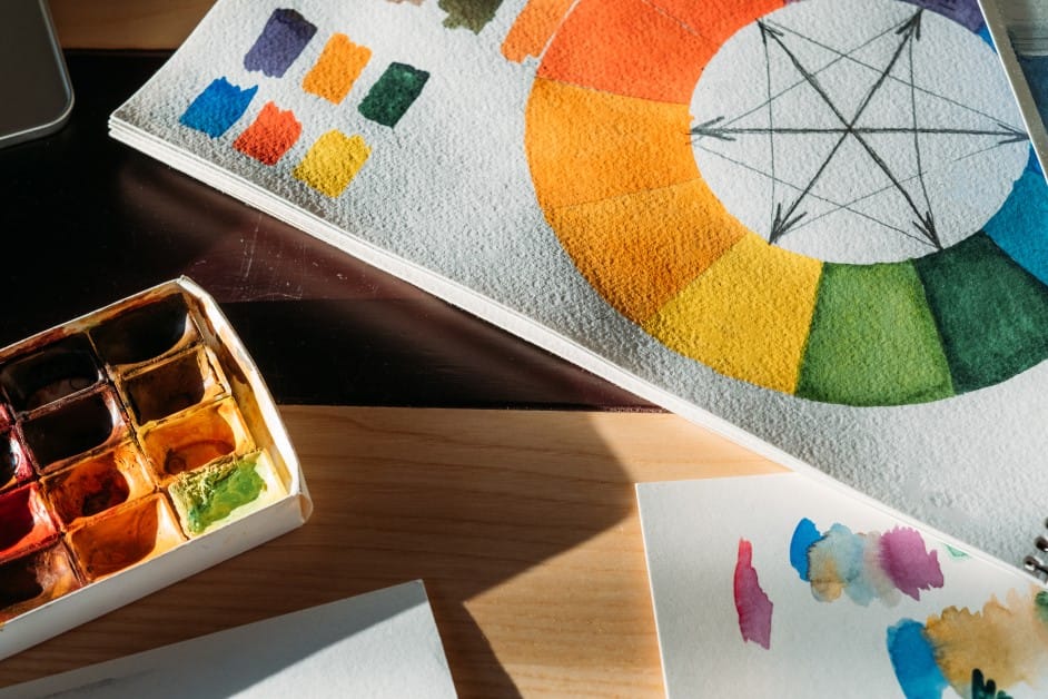
Understanding the Essence of Color Psychology
Color psychology is the study of how colors affect human emotions and behavior. It explains why some shades make us feel energized, while others instantly calm us down.
This idea is not new. As early as 1810, Johann Wolfgang von Goethe published his Theory of Colors, one of the first works to explore how colors influence human emotions. Many modern studies continue to back this up.
In one interview with environmental psychologist Dr. Sally Augustin, she explained that the spaces and sensory cues around us—including color—play a powerful role in shaping our mood.
When our surroundings lift us into a positive state, we are more creative, think more broadly, and even get along better with others.
The emotional impact of colors in interiors happens so quickly that we often don’t even realize why we suddenly feel more relaxed or anxious in certain spaces.
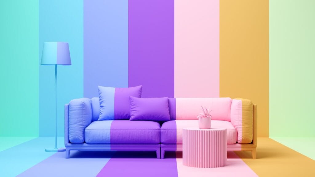
Take soft blues and greens, for example. They are strongly linked with calmness and relaxation, which makes them popular in bedrooms and spas. On the other hand, bold shades like red or orange can feel stimulating, sparking conversation and energy.
But here is the catch: color psychology goes beyond simply labeling blue as “calm” or red as “energizing.” Factors like tint, saturation, and tone all play a role in shaping how a space makes us feel.
What’s more, several studies also suggest that sex and cultural background influence color preference, reminding us that our response to color is never one-size-fits-all.
How Colors Affect Mood and Emotion in Rooms
If you are wondering about the best colors for interior design, it helps to look at how different shades affect moods and emotions. Each color creates its own atmosphere, which is why some rooms feel relaxing while others feel lively and inspiring.
Let us explore what these colors mean and how they shape our everyday experiences at home.
1. Red
Red is often associated with passion, energy, and excitement. In interiors, it can stimulate conversation and bring vibrancy to social spaces like dining rooms or living areas. However, too much red can feel overwhelming, so it works best as an accent rather than the dominant shade.
2. Orange
Orange carries warmth and enthusiasm. It’s a welcoming color that sparks energy and creativity, making it ideal for playrooms, workout spaces, or areas where collaboration happens. Just like red, it’s powerful in moderation.
3. Yellow
Yellow symbolizes optimism, cheerfulness, and light. Soft, muted yellows can bring warmth to kitchens or workspaces, creating a bright and uplifting atmosphere. Strong, saturated yellows, however, can sometimes feel overstimulating if overused.
4. Green
Green is strongly tied to nature, balance, and renewal. Studies show it has a calming effect, which is why it’s common in bedrooms, offices, and wellness spaces. Shades of green can make a space feel refreshing and restorative.
5. Blue
Blue is often cited as the world’s most favorite color. This is because blue is universally associated with the calming and positive aspects of the sky and ocean. Lighter blues promote relaxation and are perfect for bedrooms or bathrooms, while deeper blues can add sophistication and focus to offices or libraries.
5 Tips for Using Color Psychology in Interior Design and Home Makeovers
There are a few simple ways to use color psychology in interior design, even if you are not a professional. By being intentional with the shades you choose, you can transform a room to feel more calming, energizing, or inspiring. Here are some tips to guide you in your next home makeover.
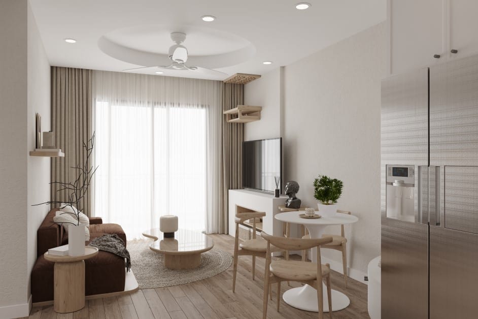
1. Use Earth Tones in the Living room
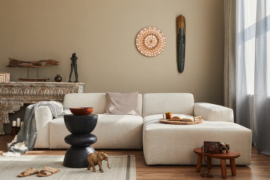
Your living room is command central for family time, entertaining, and relaxation, so you need colors that work overtime. Warm neutrals like cream, soft taupe, or mushroom gray create a welcoming foundation that makes everyone feel comfortable.
Research consistently shows that warm earth tones in living spaces help create environments that feel more welcoming and conducive to social interaction. These colors literally bring people together by creating psychological warmth and intimacy.
Consider adding pops of energizing coral or sage green through pillows and artwork to keep conversations flowing.
2. Include More Reds in the Kitchen
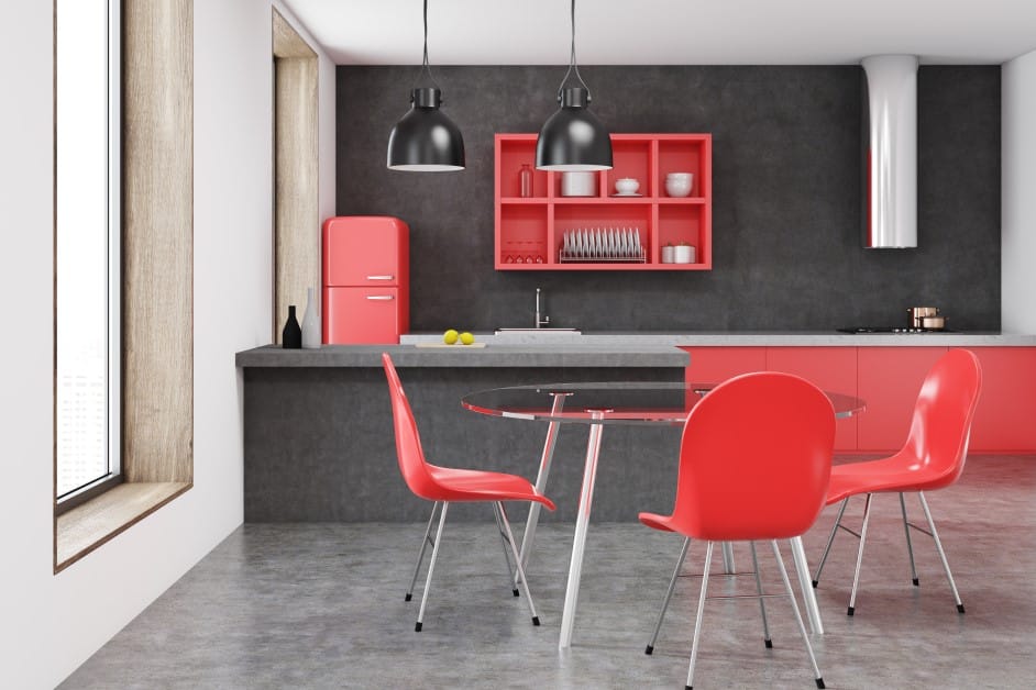
In color psychology, red is associated with passion and energy. When put in the kitchen, it may stimulate appetite and conversation. This is the reason why many restaurants often use red strategically to energize diners.
However, use it sparingly in the main kitchen to avoid overwhelming the space.
Try incorporating red through small, intentional elements like a backsplash, dishware, or kitchen textiles for a pop of vibrancy without overwhelming the space
3. Bring More Green into Your Home Office
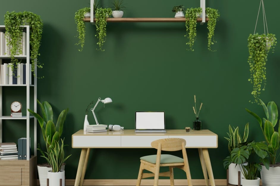
With more people working from home than ever, the colors you choose for your home office can directly influence your daily performance. Green is widely recognized for its calming effect, and studies show it can enhance focus while reducing eye strain.
Research has also highlighted the importance of green environments for children, linking them to better cognitive development.
In practical terms, you can introduce this refreshing color by painting a sage-green accent wall, hanging botanical artwork, or adding houseplants around your workspace to create a balanced and productive atmosphere.
4. Avoid Warm, Stimulating Colors in the Bedroom
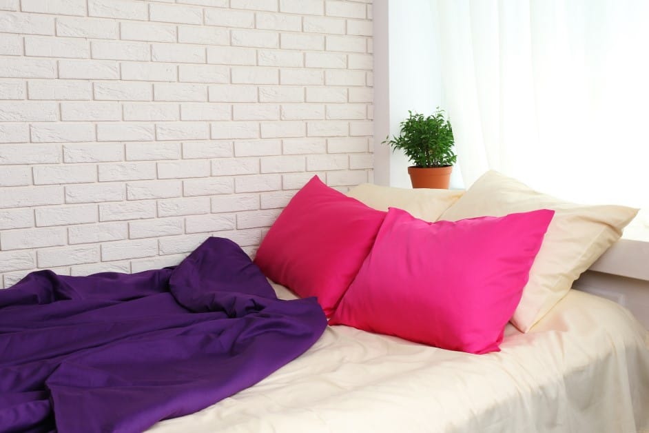
Since bedrooms are meant for rest, it is best to avoid bold reds, oranges, or other overly stimulating tones. Cool and soothing shades like pale blue or lavender are more effective, as they are often linked to relaxation and lower heart rates.
In fact, sleep researchers found that the secret to a good night’s rest may lie in a blue bedroom. Their study revealed that people who sleep in blue-colored rooms average 7 hours and 52 minutes of sleep per night—the most of any color.
5. Use Light Colors in Small Spaces
Are there colors that can make small rooms look bigger? The answer is yes!
Light, cool shades reflect more light and trick the eye into perceiving more depth, which helps create the illusion of a larger space. Soft blues, pale greens, and crisp whites are among the best choices for compact areas.
The best way to make your room appear bigger is to paint your ceiling the same light color as your walls, removing visual boundaries and making the room feel taller and more open.
The Bottom Line: Your Home, Your Mood
Colors do more than just beautify a space—they shape how we feel, think, and interact within it.
By understanding the emotional impact of colors in interiors and applying simple design tips, you can transform each room into a space that supports your lifestyle, whether it is for rest, focus, or connection.
At the end of the day, the best colors for interior design are the ones that make you feel like the best version of yourself every time you walk through your front door.